Caxton Community Legal.
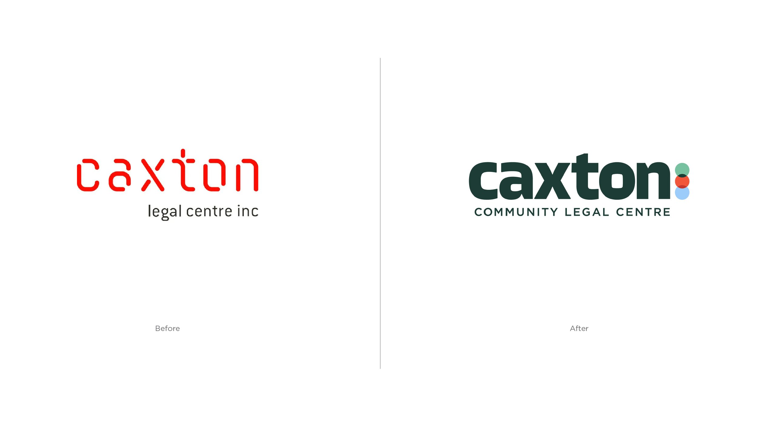
Caxton Legal Centre, a cornerstone of Brisbane’s community legal support for over 40 years, needed a refreshed identity that better reflected its mission of providing accessible, compassionate legal assistance for all. The goal was to move away from an overly formal aesthetic and instead bring in warmth, clarity, and a more human tone.
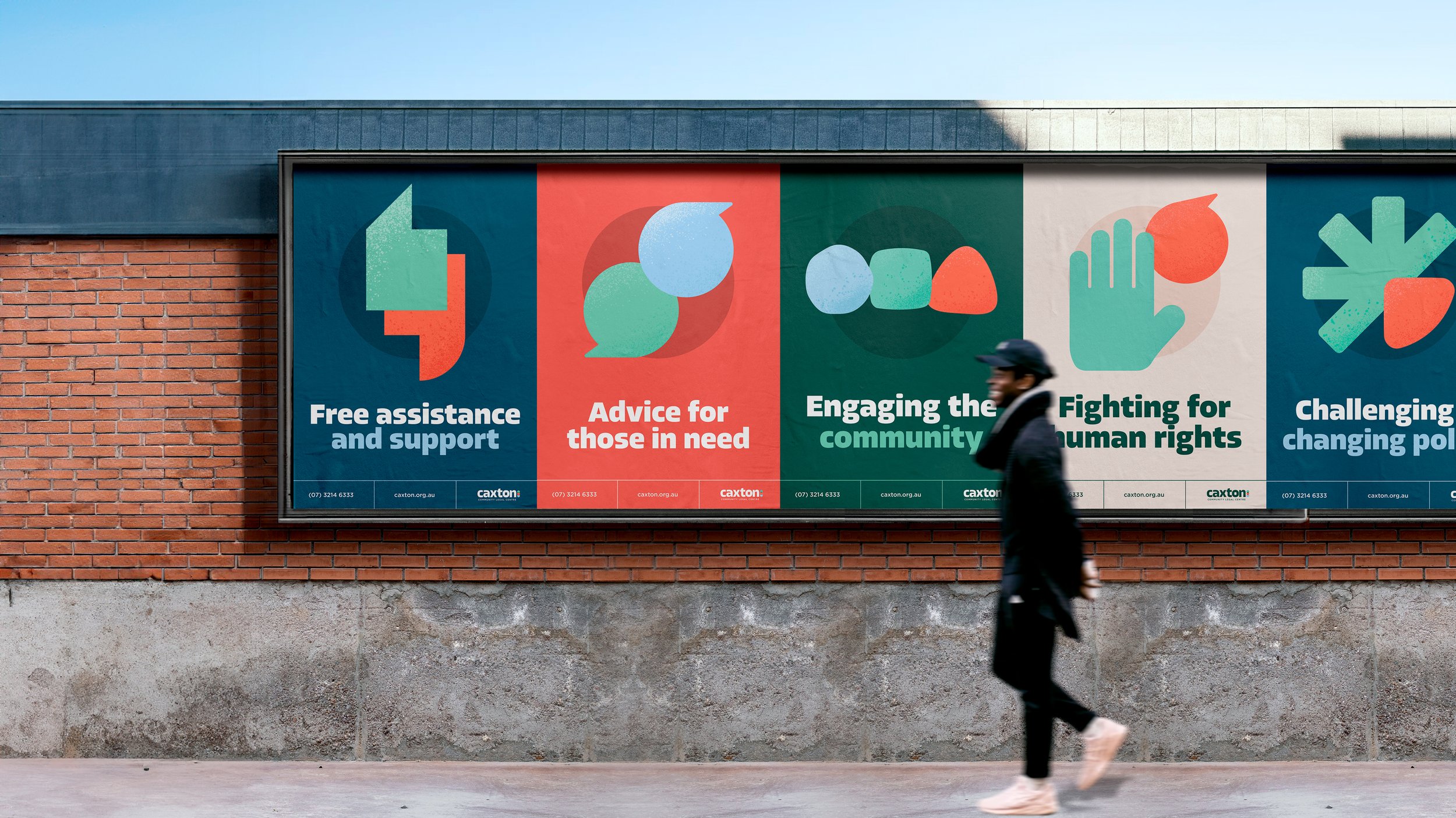
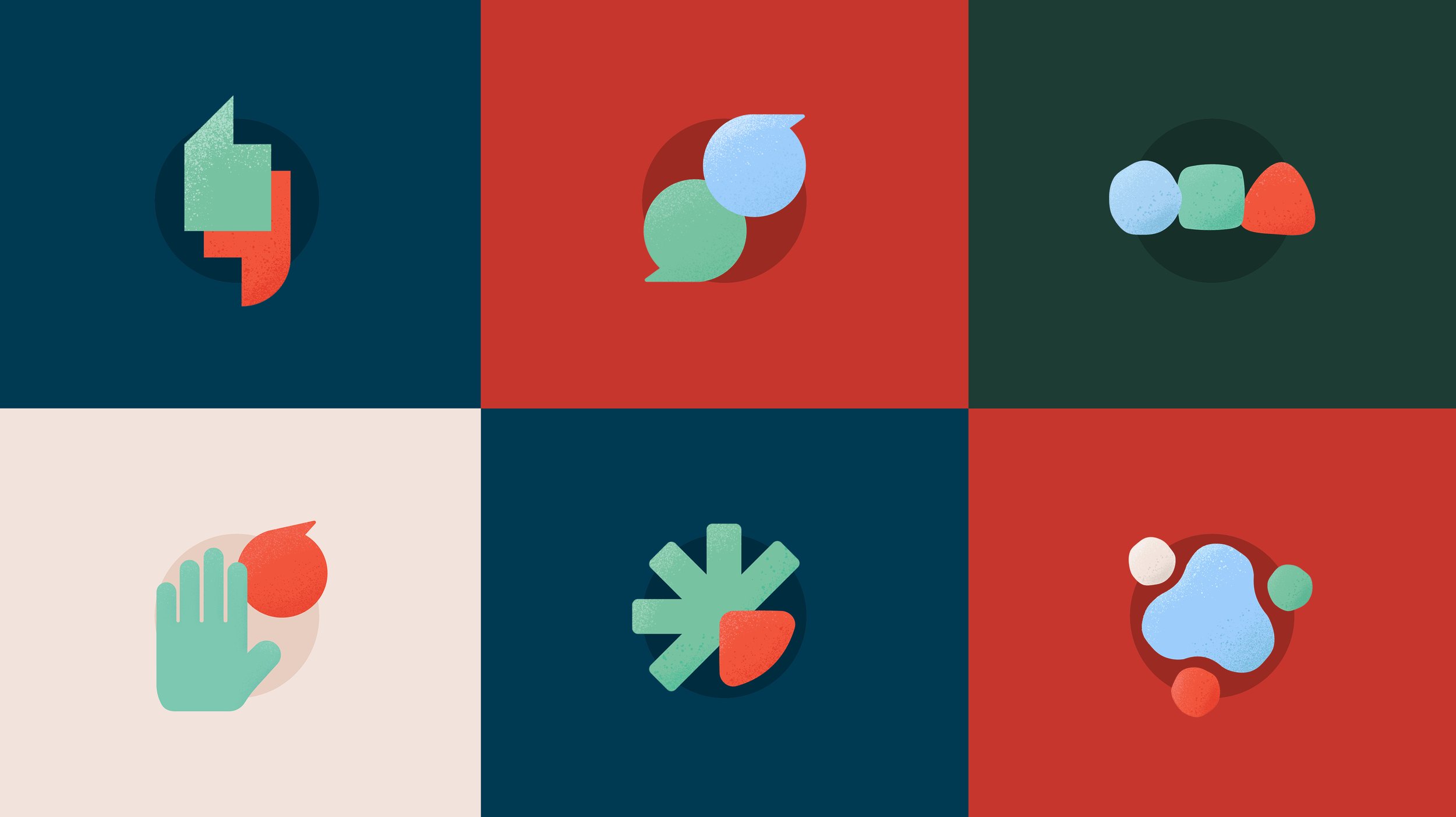
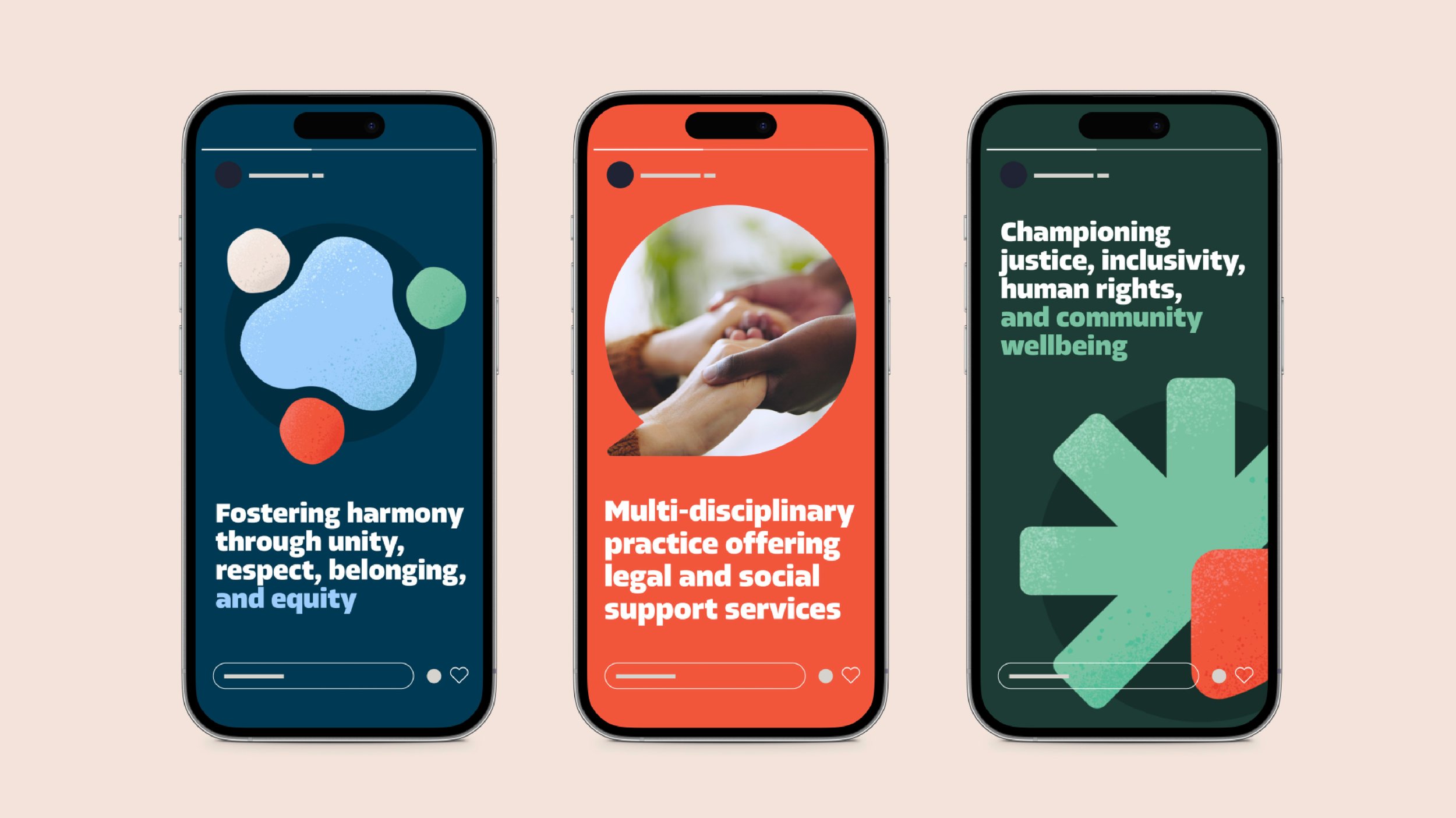
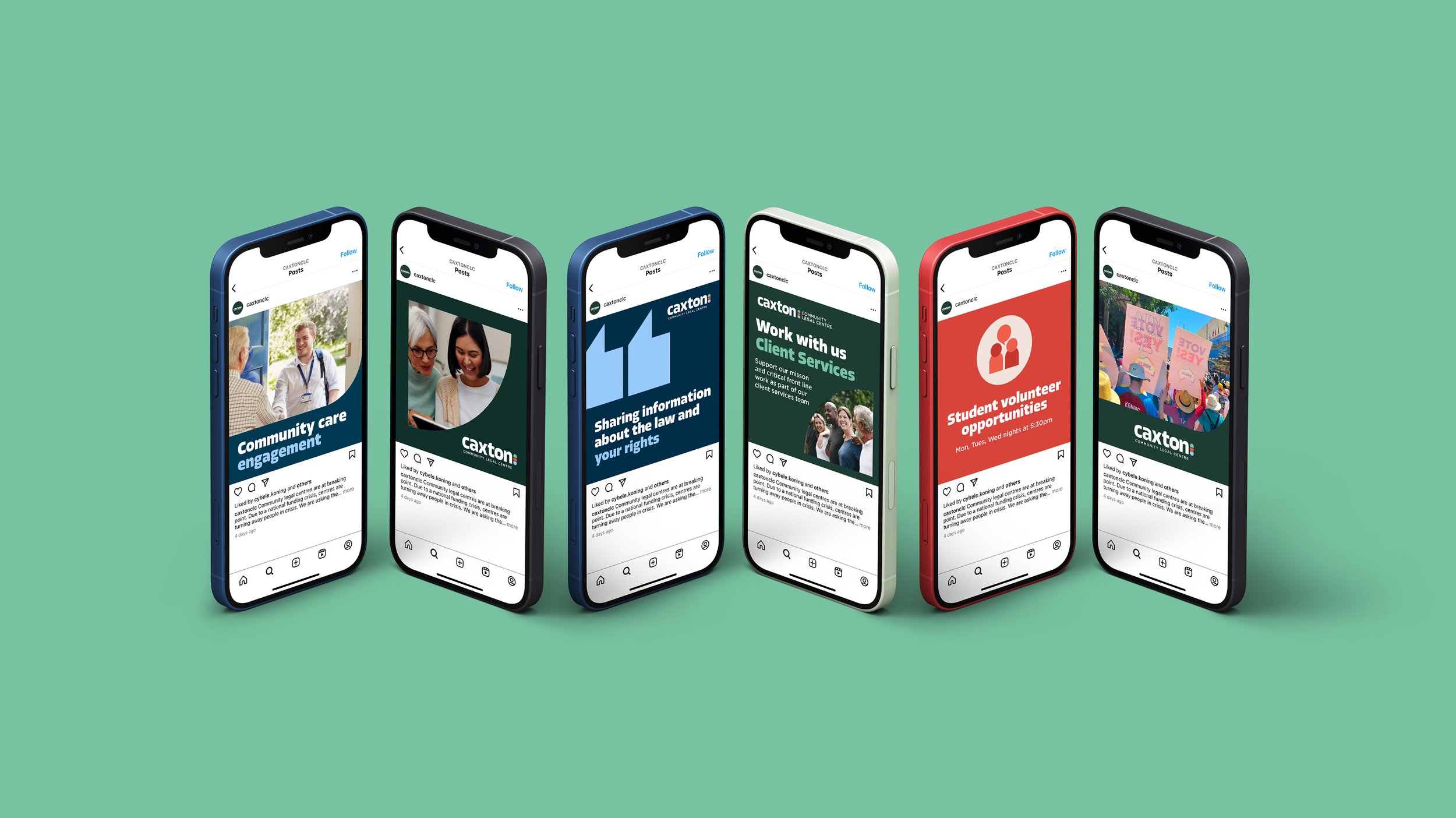
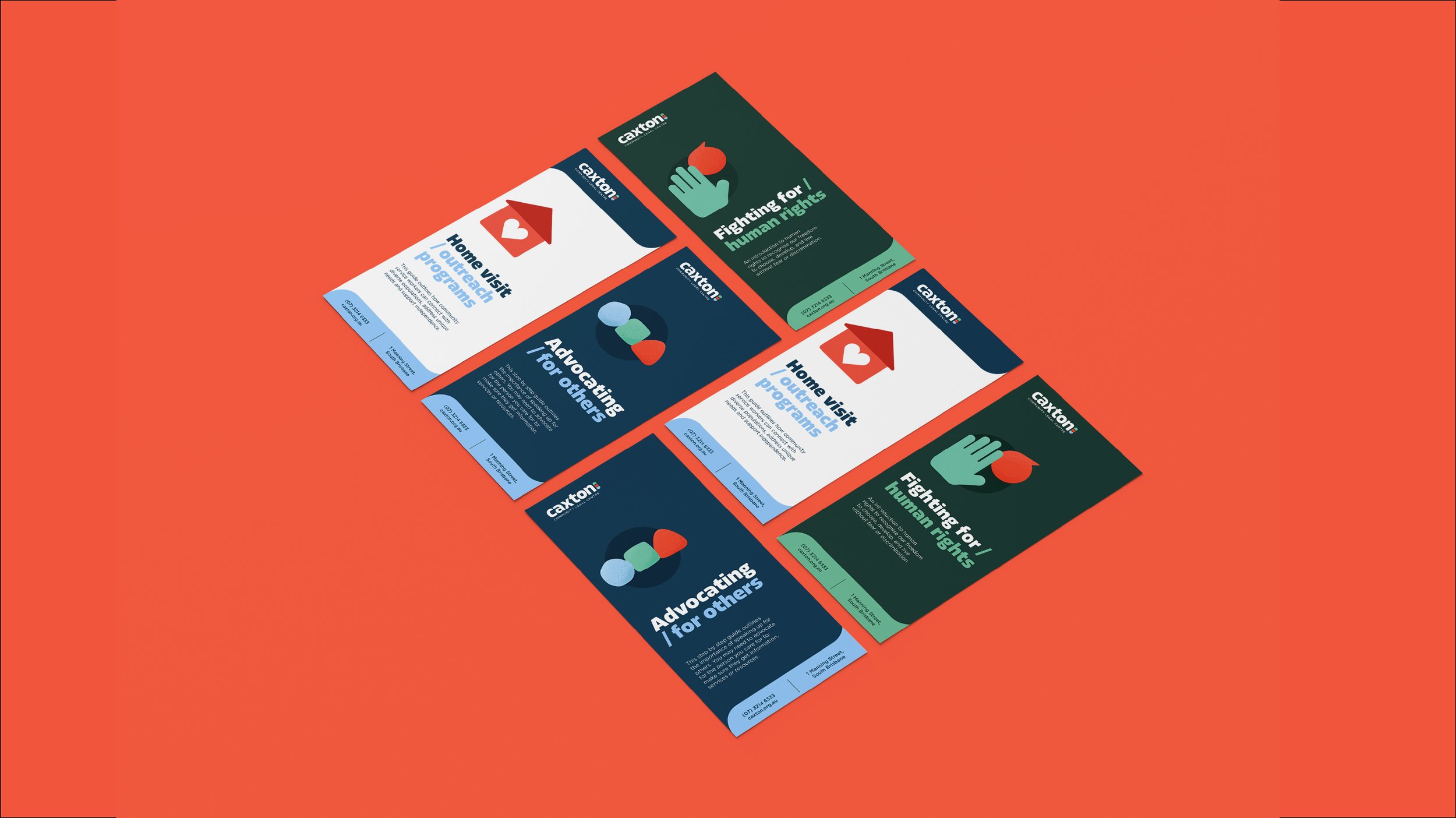
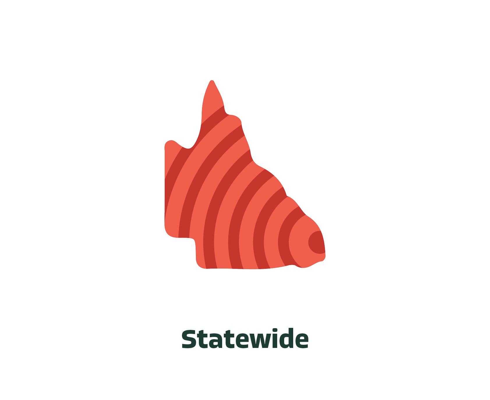
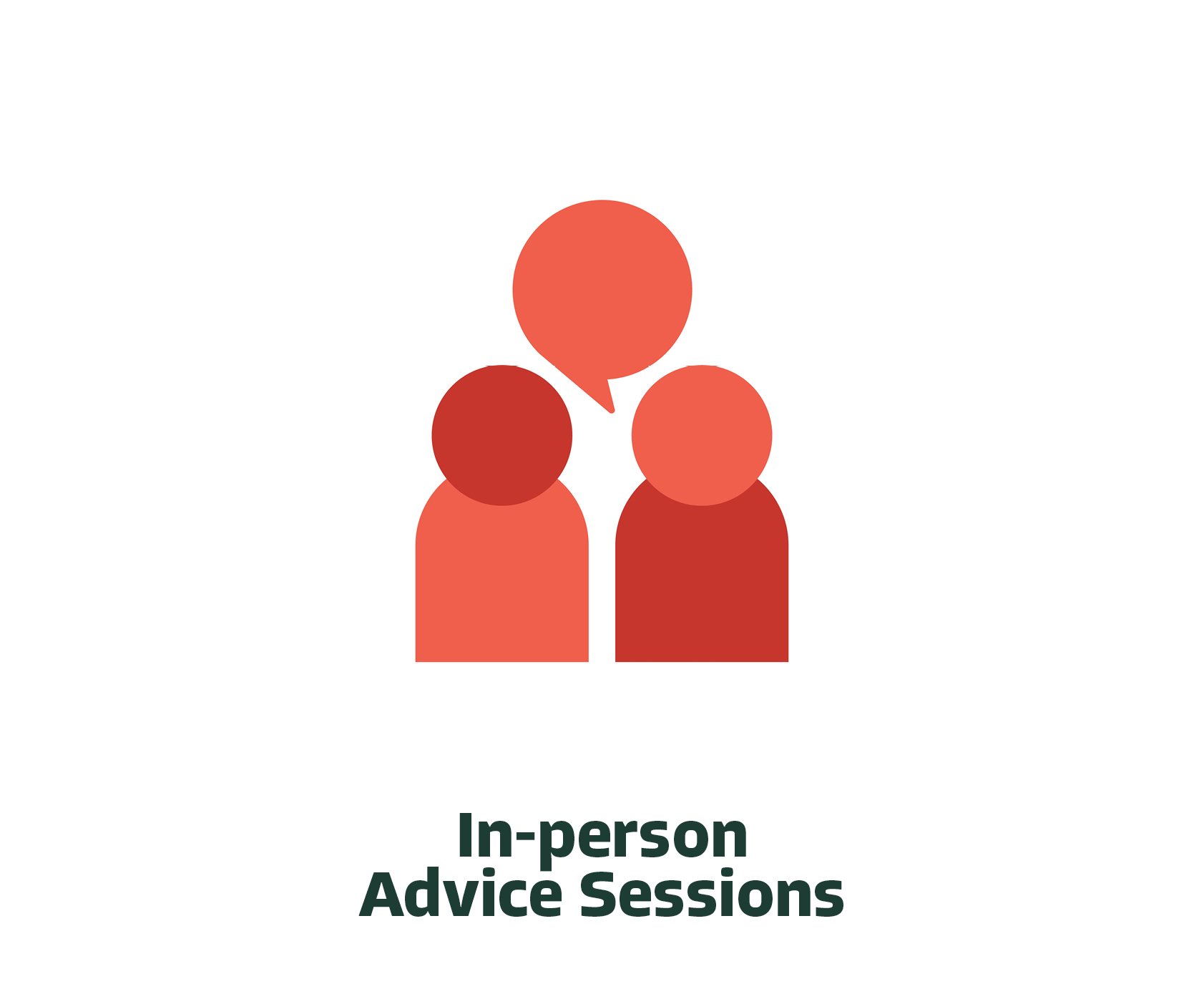
The rebrand introduced a fresh colour palette, bold yet friendly typography, and inviting textured graphic elements to help soften the perception of legal services. I also created a suite of custom thematic and descriptive icons to help represent complex topics in a clear and approachable way across printed collateral, the website, and digital tools.
Together, these visual tools worked to create a more welcoming experience for users. This positioned Caxton as a community-first, supportive legal service provider. The new identity continues to support stronger community engagement and makes Caxton’s vital services feel more accessible and easier to navigate.
Completed at Brother & Co in 2024